ShortVi Beta
Return to Topic List

CTR Dropped After Changing Thumbnail Style – What’s the Best Approach for Gaming Videos?

Thumbnails & SEO Created: 01.08.2026 19:07 3 Views


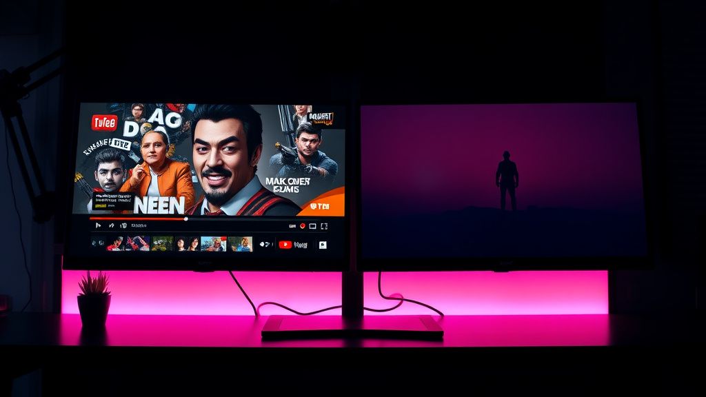
Comparison of cluttered vs minimalistic YouTube gaming thumbnails on a monitor in an editing suite

Comparison of cluttered vs minimalistic YouTube gaming thumbnails on a monitor in an editing suite
Zoom


Hey everyone, I've been running a gaming channel for about a year now, and my CTR has been hovering around 5-6% consistently. Last month, I decided to switch up my thumbnail style – I went from the typical 'shocked face + big text' to a cleaner, more minimalistic approach with just a single character and a subtle color grade. I thought it would stand out, but my CTR has dropped to 2.8% across the last 10 uploads. I'm not sure if it's the style itself or if I'm just not testing enough variations.

I use Photoshop and have templates set up, but I'm starting to think I need to rework my entire strategy. Should I go back to the loud style, or is there a middle ground? Also, how important is consistency in thumbnail style for building a brand vs. adapting to what the algorithm wants? Any advice on A/B testing thumbnails effectively would be greatly appreciated!

Replies (5)

I've been through the exact same thing. When I switched from faces to minimalistic thumbnails, my CTR tanked for a couple weeks. But here's the thing: it wasn't the style itself – it was that my audience wasn't used to it. YouTube's algorithm also needs time to learn who clicks on your new style. Give it at least 10-15 videos before judging. However, you can accelerate this by using YouTube's 'Test & Compare' feature in Studio (the thumbnail A/B testing tool). It's available on desktop for videos after they're uploaded, and you can test up to 3 thumbnails. I'd recommend testing your old loud style vs. your new minimalistic one on your next few videos. Just make sure you let each test run for at least 2 weeks or until you have statistically significant data (usually 10k impressions per variant). That's what I did, and my CTR actually ended up higher with a hybrid approach – a clean background but with a small, expressive face in the corner.
Always testing the YouTube algorithm.
Great point about A/B testing. I'd add that consistency matters more than you think. If you've been loud and flashy for a year, your audience expects that. Switching to minimalistic might confuse them. But also, check your analytics – are you losing clicks from your existing subscribers or from new viewers? If it's new viewers, your thumbnails might not be communicating the video's value clearly enough. For gaming, I've found that showing the game's environment or a key item/weapon works better than just a character. Also, don't underestimate color contrast – the thumbnail needs to pop in the dark mode YouTube interface. I use a tool called 'Thumbnail Test' by TubeBuddy to get a heatmap of where eyes go, but honestly, the built-in Test & Compare is enough. Just be patient and don't switch back and forth too quickly – consistency in testing is key.
Focus on retention, the rest will follow.
I'm a sound guy, but I've seen this issue with many creators. Here's a different angle: your CTR might not be the thumbnail's fault – it could be the title. If you changed your thumbnail style, did you also change your title format? Sometimes a mismatch between title and thumbnail confuses viewers. For example, if your title says 'INSANE 1v5 CLUTCH' but your thumbnail is a calm character, it's jarring. Make sure your thumbnail and title tell the same story. Also, consider the emotional trigger – gaming thumbnails work best when they show a moment of high tension or reward. Even minimalistic can convey that with the right composition. For instance, a character with a glowing weapon or a subtle explosion in the background. Don't throw the baby out with the bathwater – iterate on your new style rather than abandoning it.
Sony FX3 shooter | Love color grading.
I've been making Shorts for a while, and I've noticed that CTR on Shorts is different, but the principle remains: the thumbnail (or first frame) needs to hook in the first second. For long-form gaming, I'd recommend checking your impressions and CTR by search vs browse. Sometimes a style change affects browse traffic more than search. In your case, if you're relying on browse, a clean thumbnail might get lost among the clutter. Try adding a subtle border or a slight vignette to make it stand out. Also, don't forget about mobile – 70% of my viewers are on mobile, so test your thumbnails on a small screen. A minimalistic thumbnail might look great on desktop but get lost on a phone. I use a simple trick: I zoom out to 50% in Photoshop and if it still reads well, it's good.
Keep rendering, keep uploading.
Thanks everyone for the detailed advice! I took a step back and realized I was being too hasty. I'm going to use the Test & Compare feature on my next video, testing my old style vs. a hybrid version (clean background but with a small expressive face). I also checked my analytics and saw that my CTR from new viewers dropped, but my subscriber CTR actually stayed the same – so it's about new audience perception. I'll also make sure my titles match the new tone. Appreciate the tips on mobile testing and color contrast – I'll definitely zoom out more often. This community is awesome, thanks for saving my channel from a panic!
Sony FX3 shooter | Love color grading.

You must register or log in to reply to this topic.

Related Topics & Similar Discussions

YouTube CTR dropped from 8% to 2% after thumbnail change – what am I doing wrong? Category: Thumbnails & SEO
Click-through rate dropped after I changed my thumbnail style – what's going on? Category: Thumbnails & SEO
Thumbnails tanking CTR after YouTube's 2026 layout update – what's working now? Category: Thumbnails & SEO